Here's How I Got Here >
Project KPI

Understanding Users
I partnered with the Co-founders to conduct a survey that received 120 responses. The Senior UX Designer and I then conducted 10 user interviews based on which I identified three personas. This helped identify user’s needs and real problems.

Insights
I condensed our insights from 10 user interviews and 120 survey responses & partnered with the Senior Designer to create 3 Personas and 3 Empathy Maps.

Empathy Map
Here is an example of my observations and insights for the power user. Condensing my research into an Empathy Map helped me see what features would be a gain for us and what aspects would help me reduce existing pain points for users.

Competitive Analysis
I tracked ways Lumos’s competitors were solving problems that I found out in our research. I compared the most popular meme and social-media apps. This helped me ideate what can be improved and where opportunities lied for us.

Feature Roadmap
I collaborated with the head engineers, co-founders and senior designer & considered the technology, building cost, and impact of the feature. It was essential to prioritize
key features for the MVP.

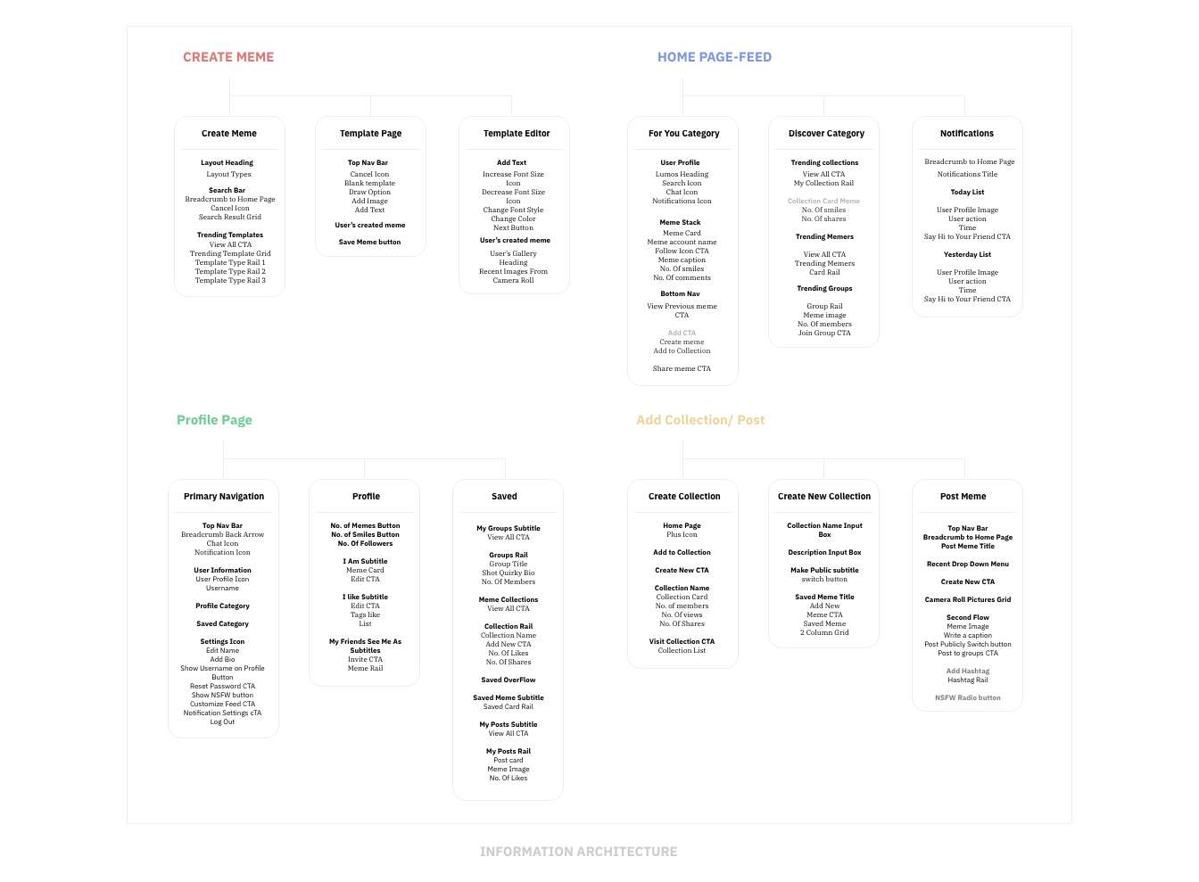
Information Architecture
Once the features were prioritized, it was time to create a pleasant navigation.
To do so, having a basic IA structure for our main journey was key.
Paper Sketches
After forming the IA, we were ready to iterate. I collaborated with the Senior UX Designer to visualize the IA via paper sketches. I then converted these into multiple Low fidelity iterations.

Design-Low Fidelity Wireframes
Creating different low fidelity iterations using Figma and After Effects, helped us weigh strengths and weaknesses. I then implemented the feedback into the MVP.

Feedback:
1. Iteration 1 didn’t satisfy our need to prioritize creating posts as users come for that. Hence, we designed an iteration 2 to solve this problem.
2. We then asked 5 interviewees who all agreed it was easier to create collections from the profile page, hence we went ahead with Iteration 2.
Style Guide – Atomic Design
Since the app is about creating memes, the UI had to be playful. Majority of our survey responses used dark mode. Creating a joyful style guide with dark mode was a challenge. I worked with the Senior designer to create an Atomic Design.

Designing the Interface
I worked with the Senior UX Designer to design the interface. These went through several revisions taking feedback from our beta testers.
HOME PAGE – FOR YOU & DISCOVER CATEGORIES
1. For You: Users will see a meme stack that they can swipe left or right. This experience is personalized to each user based on their humor type and behavior.
2. Users can comment on a meme, tag their friends, share to their groups. Instead of no. of Likes, users can see the no. of smiles a meme got.
3. Discover Page: Here the user can view trending Collections that they can save, Memers that they can follow and Groups that they can join.
PROFILE PAGE

1. This interactive profile section is catered to building close relationships with friends. They can click on the Invite CTA and invite a friend to pin a meme on their profile.
2. Users can see how many memes the person has posted and how many smiles their memes have received.
3. Saved section: This section allows users to look back on memes that made them laugh, their old posts and create collections.
4. Meme collections are designed in the form of a music playlists that are perfect for the user’s different moods and environments.
MEME CREATOR

1. Meme Creator: Users can create their own memes using trending templates, their gallery, or from scratch.
2. Personalizing memes: Users can personalize memes to make them more relatable to their friend group. They can add text, draw or add an image from their camera roll.
3. Sharing: These memes can be directly shared to friend groups, posted, added to a meme collection or even shared via other social media apps.
User Testing
We had 22 students from Stanford, Berkley & Parsons along with 2 Instagram meme creators test the prototype. I along with the team asked the testers to complete a set of tasks and asked for their feedback. This was conducted over video call during a pandemic! I then went back to the HEART framework I defined, and used it to measure the solution.


